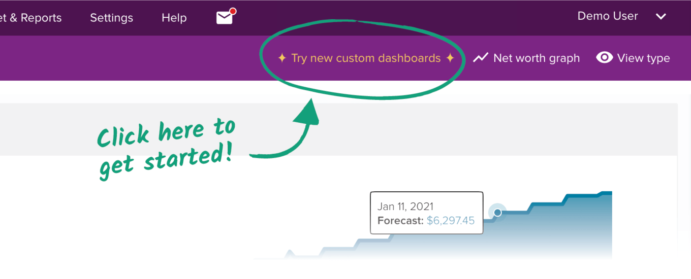
You can now preview new custom dashboards for web! If you’re a beta user, you would have seen the link in the Dashboard toolbar to give it a try over the past few months. Now, everyone will see this link on the right hand side of the current Dashboard.
This post will discuss our motivations for working on new custom dashboards for the web app, plus its current and future features.
At the core, it’s so PocketSmith can better help people solve their financial problems. Your information is currently spread across 12 years of feature evolution. While PocketSmith can answer nearly any question about your finances, finding those answers requires in-depth knowledge. The new dashboard gives us a platform to bring all the answers you need into one place.
Our features have a lot of flexibility and depth built-in, but this means that specific insights can be buried. You might find yourself scanning forward in the Calendar to find the date a forecasted balance is reached or pulling out the calculator to figure out your offset mortgage balance. The new dashboard frees us from trying to deliver all the answers within existing features. It provides a testbed for interpreting the same data in different ways — without affecting the core experience.
We also wanted to speak to you, our users — the makers and craftspeople for whom we build PocketSmith. People who’re unafraid to try new things and experiment. Those who don’t shy away from complex configuration and love nothing more than digging deep into tools to craft something for yourself, reshaping things as you proceed. For you: the dashboard has allowed us to lean into what flexibility can mean in displaying your financial data.
And for us — dashboards use exciting new technology. Something that every person will use every time they log in — a place where we can dream.
But it all comes down to one core tenet: the new dashboard will let you solve your financial problems more effectively through complete access to your critical information, tailored specifically to what you need.
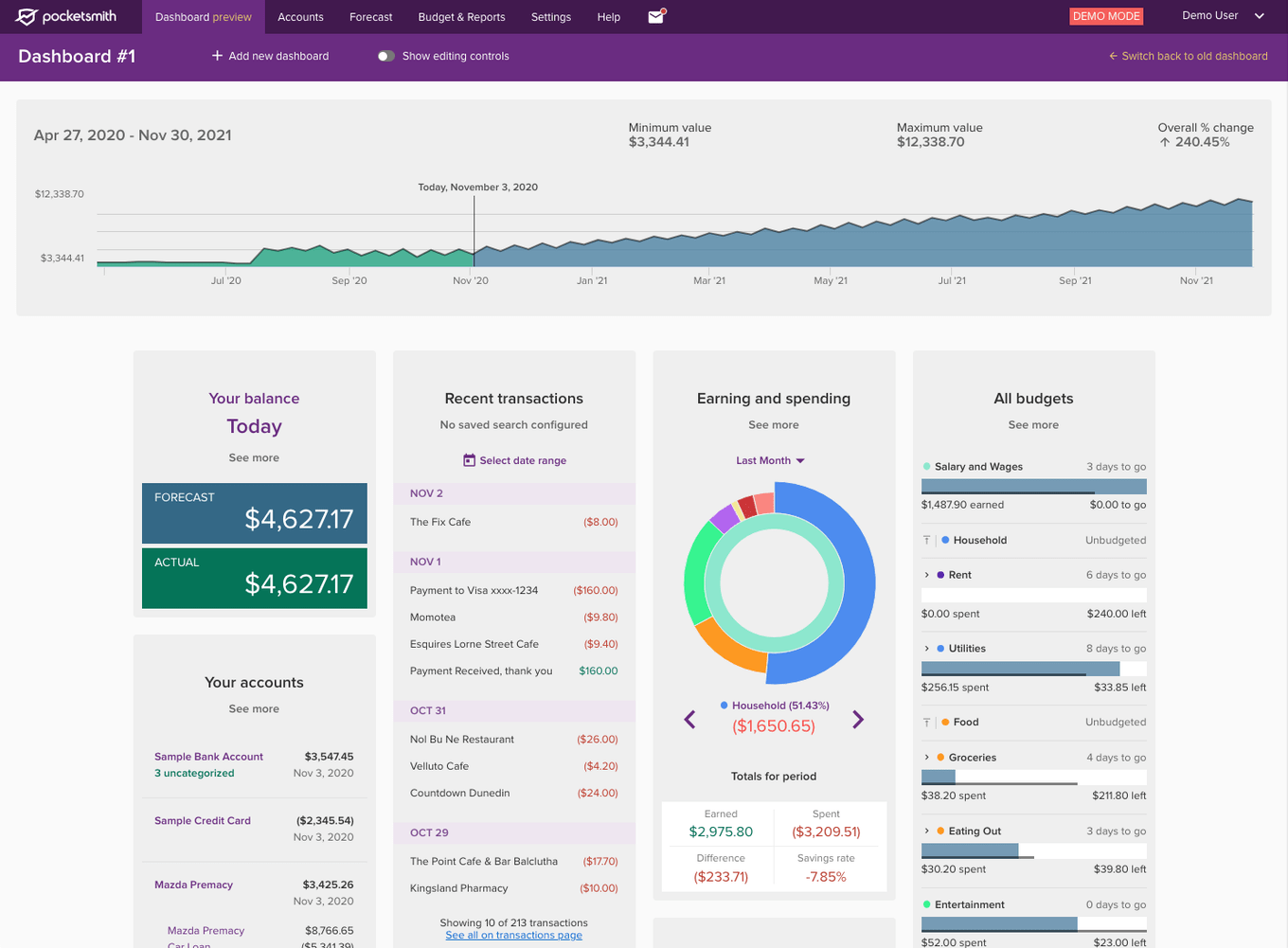
We’ve built a fantastic base from which we can expand now and into the future. Below is what you’ll find when you try out custom dashboards right now.
It is entirely configurable, with a focus on flexibility. Everything is built to be customizable, allowing you to arrange your dashboards to best suit your needs.
Support for multiple dashboards. Different dashboards can serve different needs — one as a jump-off point for regular financial check-ins, one to help you curb unnecessary spending, and another for tracking your progress towards being financially independent.
You can duplicate dashboards to create a copy and tweak it quickly. Or experiment with something new while keeping the original dashboard safe.
Flexible column structure means you can have specific dashboards tailored to suit different devices — 3 columns for your tablet, 5 columns for your laptop, and a 12 column behemoth for your 4K display.
And finally, it features many adjustable widgets and dashboard templates which get you started quickly. Read on for more details on these!
The widgets for custom dashboards don’t skimp on the configuration. Each widget can be added multiple times to your dashboards, with each being separately configured to serve different purposes. There are 11 widgets ready for the feature preview.
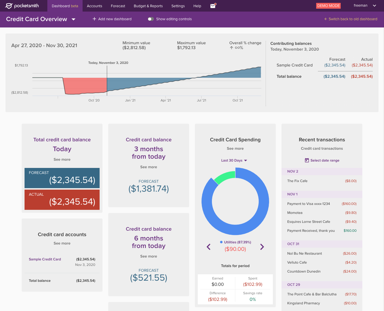
You can easily add preconfigured dashboards in a couple of clicks, such as a dashboard to help you better control spending or get a quick overview of your last 30 days.
Templates provide a handy base for further customizing your dashboard and quickly letting you see how capable the new dashboard is. They also allow us to work with our users to provide a great out-of-the-box experience to solve specific financial problems.
We’re launching with six dashboard templates for the feature preview.
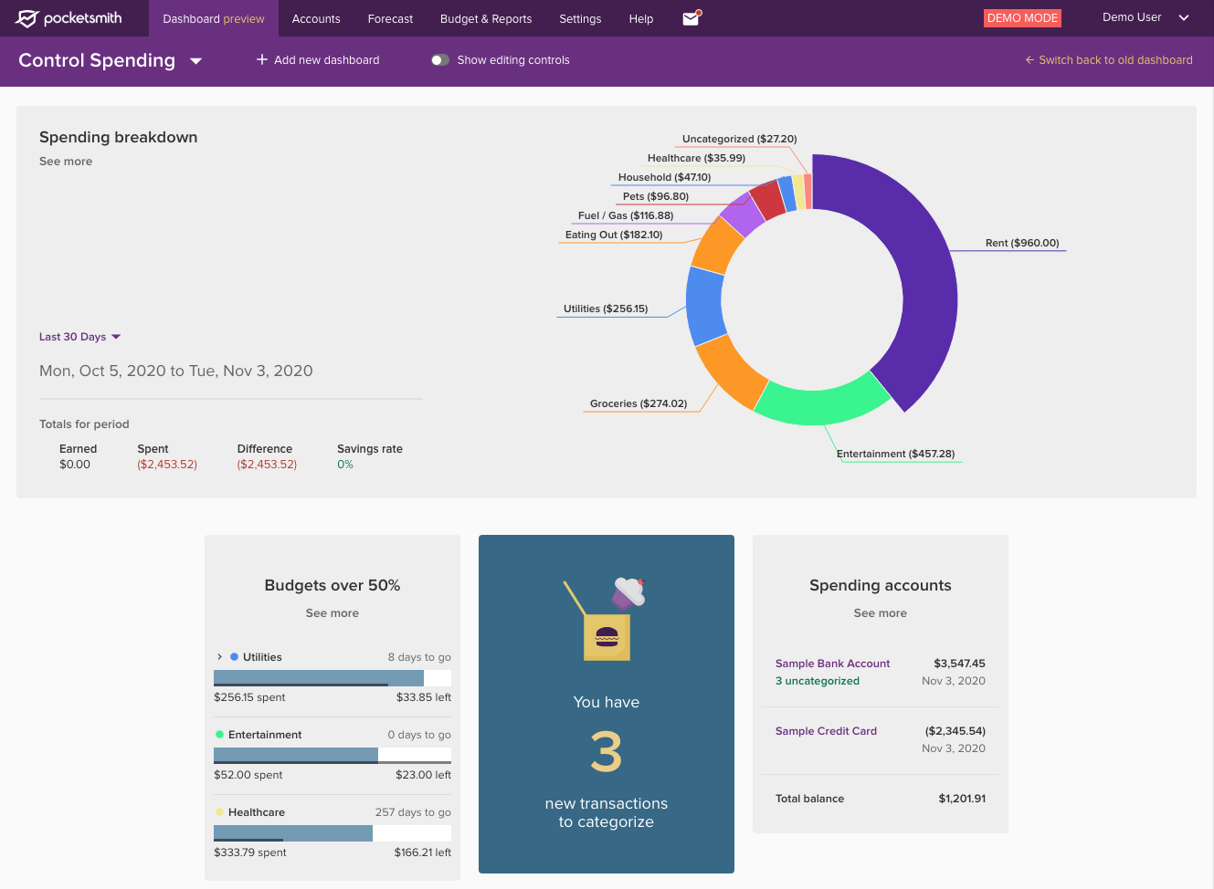
Below are a few of the plans worth mentioning at the start of the feature preview.
Widget design tweaks and improvements — while the widgets feel great for the feature preview, there are areas that we’d like to continue to refine. We’ll be experimenting with tweaked designs and considering options for visually condensed versions of particular widgets.
Widgets that have only recently been released — such as the balance alert and budget widgets — will be getting adjusted as we learn more about how people use them.
More widgets — we’re excited about new widgets that we can add as the feature preview phase progresses. The narrow scoping of widgets means we can experiment and try new things.
We’ll also be taking feedback and improving existing widgets as we go, so please send your feedback through to us.
There are likely to be bugs and quirks in the new dashboard. While we’ve tested the dashboard extensively, our users have unique data and use PocketSmith in unique ways.
You might experience quirks due to your account being set up in a certain way. So if something looks to be out of the ordinary, it probably is — please let us know about it.
The feature preview phase represents the next step towards the bright future of having the new dashboard replace the old. Our timeframes around reaching this goal are loose, but we have a planned process for how we’ll reach that stage.
Feature preview starts now, with the link to “Try new custom dashboards” popping up in the old dashboard’s toolbar. We’ll be taking feedback over the coming months and adjusting the dashboard as we learn how everyone uses it.
Full release is when we deprecate the old dashboard entirely, and everyone moves over to the new dashboard. We’ve modelled the default template off the old dashboard, and this will be set up for everyone to ease the transition.
Iteration on the dashboard will not stop when we hit full release. We’ve got big plans, and we can’t wait for you all to become involved in the process of deciding where the dashboards go from there.
We’re incredibly excited to get to this stage, and we hope that after reading the above, you are too.
Head to the current dashboard to switch to the custom dashboard feature preview. We’d love to hear your feedback, so we’ve set up a feedback form that lets us know what you think.
Please, go forth and create, PocketSmithers of the world!