Dashboards are one of my favorite things about PocketSmith. You can go as macro-overview or micro-detail as you like, they’re endlessly customizable, and for an added bonus — you can run as many dashboards as you’d like!
Let me give you the quick rundown of how I use mine (all three of them), and then I’ll take you through my top five widgets.
widget | ˈwɪdʒɪt |
noun
1. A small gadget or mechanical device.
2. (Computing) An application, or a component of an interface, that enables a user to perform a function or access a service.
- Oxford English Dictionary
Okay, carry on…
If I only have five minutes a week to take a glance at my finances, this is where I come. A balance graph of my everyday accounts, active budgets, monthly spending donut… it’s all here. I also keep a couple of tracker widgets: One for my Net Worth (tracking up) and one for my Student Loan (tracking down).
It’s simple: I hate debt, so I make myself look at it. It’s like exposure therapy for arachnophobes, except it’s my student loan. A balance graph tracks my total, while a budget widget tracks repayments. Forecast widgets look ahead to tell me what the balance will be in 3, 6, and 12 months’ time.
This is the ‘everything else’ dashboard. The banner Sankey is pure fun for seeing my money flows. I keep a close eye on some spending-creep areas too: One with a donut filtered by label, the other with a transactions column widget.
The Balance Graph — hello, old faithful. Look, I just want to see my money, okay? I want it to be at the top of the dash, I want to see if it’s tracking up or tracking down, and I want the option to include or exclude certain accounts. It’s as simple as that. The balance graph lets me do it all seamlessly. It might not be as flashy as some of the young’uns coming through (looking at you, Sankey) but it doesn’t need to be. This sturdy workhorse is the backbone of my dashboard.

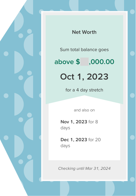
I love the Balance Alert widget for its sheer versatility. I have versions of it on two out of three dashboards. The common use is to alert you if your balance drops below a set amount, but I use it for more or less the opposite. Growth mindset, hello! I’m tracking upward here.
Widget 1 is set to show “all accounts”, thus giving me my total Net Worth number. It forecasts ahead to tell me when I’ll cross my next significant-number threshold.
Widget 2 is set to “student loan only.” Based on my current repayments, it forecasts ahead and tells me what date I’ll have my loan paid off (not soon enough!)
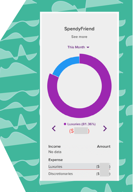
This one, I figured out for a client before I started using it myself.* Their problem: How to show spending in one sector when that sector is spread across all your existing categories. For me, it was realizing that every time I caught up with a certain friend, I spent more money than I’d intended to. But how could I see that on my dashboard?
The solution: Labelled transactions and a filtered Earning and Spending Donut.
Now I label any transactions involving that one friend. I have a Donut graph with all my existing color-coded categories, but instead of showing monthly transactions, it displays transactions with that label. This shows me exactly how much extra I spend (ouch), and motivates me to suggest cheaper alternatives instead of another expensive lunch out.
*I do freelance PocketSmith consulting! Get in touch.
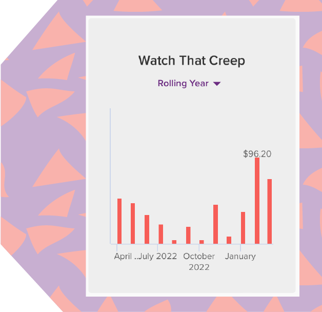
Lifestyle creep is a menace, innit? The minute I start earning decent money, my wallet pipes up and wants in on the fun. I try to keep an eye on the creep, if only to squash it before it gets out of control. Hence this widget.
Take a transactions column widget, filter by whichever categories or saved searches you’d like, et voila. Instant mini trend graph, right there on your dashboard.
And my absolute favorite…
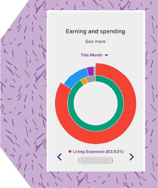
Like the balance graph, some things are just an instant classic. The monthly Earning & Spending Donut was a big drawcard for my decision to join PocketSmith in the first place. It was the first thing I put front-and-center on my dash, and it continues to be a firm favorite and the thing I recommend to most clients.
I haven’t found anything else like it for seeing my income and outgoings represented spatially at a glance, while utilizing the color-coding from my existing categories. Not for me, the basic red-for-expenses, green-for-income: Say hello to the whole dang rainbow. The donut is colorful, it’s visually appealing, it’s informative in a way that doesn’t take three PhD’s to understand… what’s not to love?
Mmm, donuts.
Rachel E. Wilson is an author and freelance writer based in New Zealand. She has been, variously, administrator at an ESOL non-profit, transcriber for a historian, and technical document controller at a french fry factory. She has a keen interest in financial literacy and design, and a growing collection of houseplants (pun intended).